In this case study we are going to focus on the choice of colour tones to really embellish a cuff-link design. You may have thought that the colour choice is completely arbitrary depending on the designer’s mood or outlook on any particular day, but hopefully this case study will show a lot more thought goes into the process…
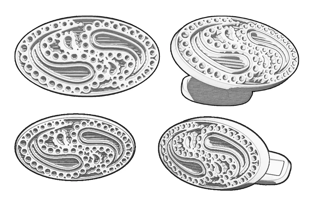
Initially an idea for a cufflink is generated through a series of sketches. When the designer is happy with the feasibility of the design, the cufflink is modelled in a CAD package. This enables the design to be rendered in different materials quickly to make an informed decision on style and also provides a file to communicate with CNC machinery to allow the design to be manufactured efficiently. The design can be scrutinised with sophisticated tools such as height analysis to ensure that it has enough depth to hold the enamel that will be used to add colour.
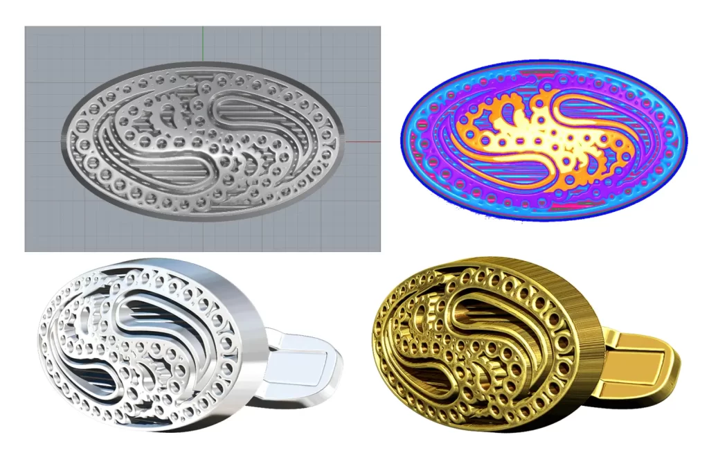
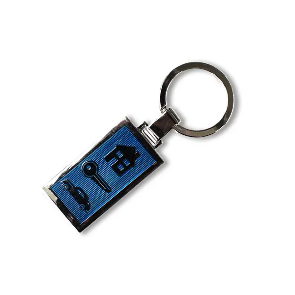
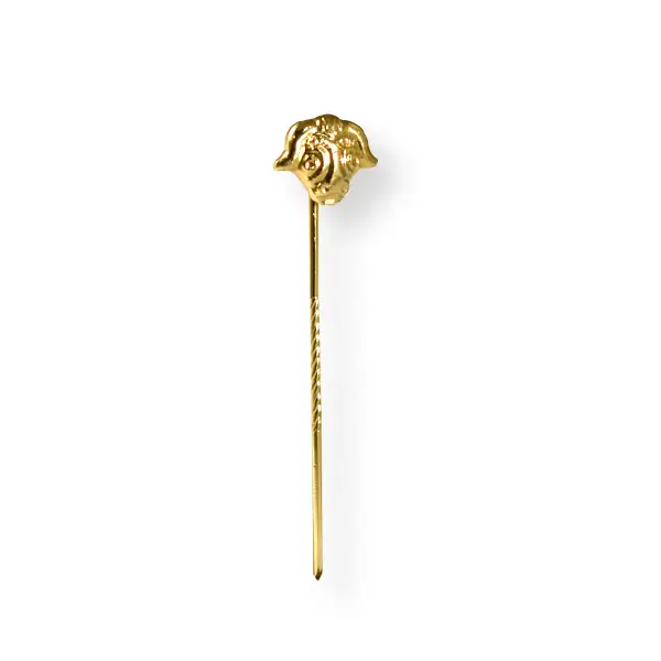
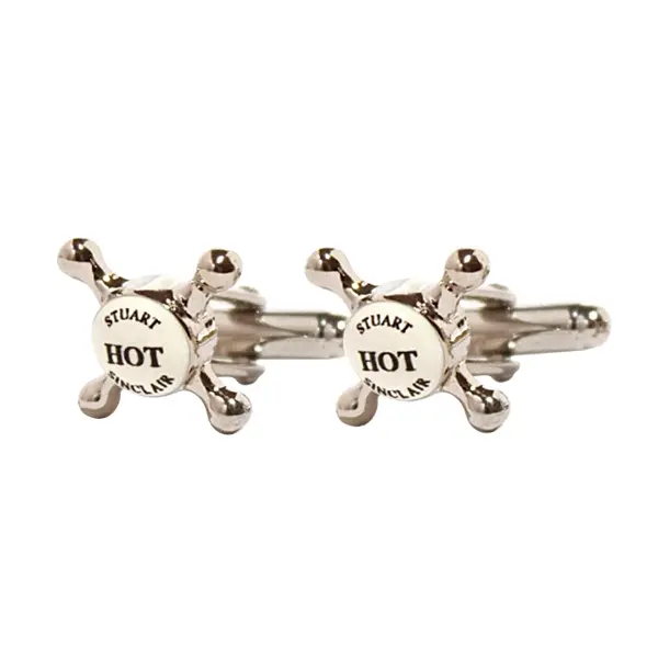
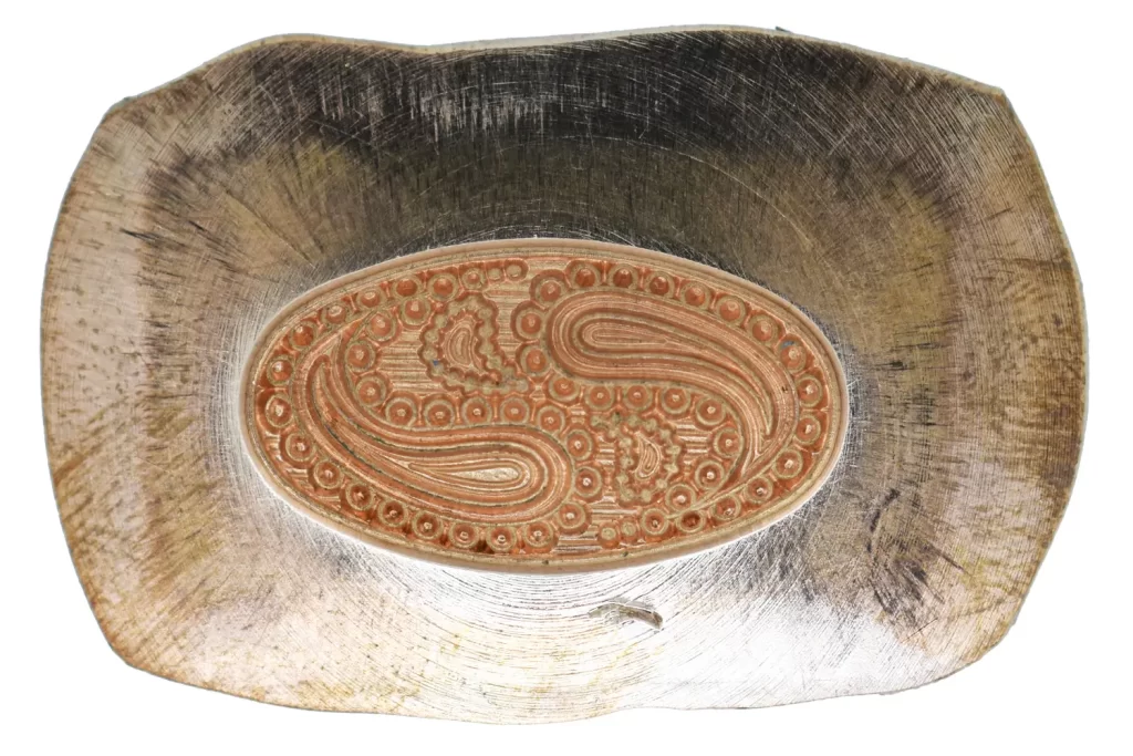
The CNC Machinery is used to cut a die, and this is applied to a press machine to generate the stampings that will eventually become the final cuff-links. The stampings are trimmed to size and the cuff-link fittings are soldered into place. Finally, the whole cuff-link is plated with a layer of precious metal, unless the original stampings and fittings were made in precious metals. The cuff-link is now ready for a splash of colour.
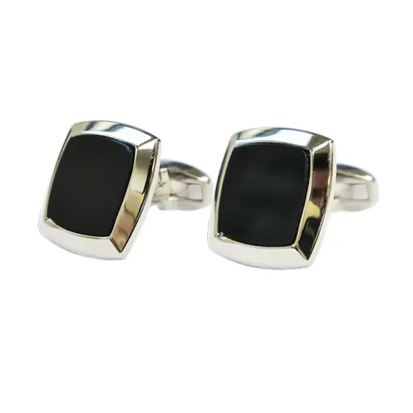
When adding colour to a cuff-link it is important to remember that the cuff-link is an accessory and as a result it should complement the ensemble it will be worn with, not look at odds with or contrast starkly. Cuff-links tend to be worn with suits and the traditional colours for suits are black, greys and navy blues.
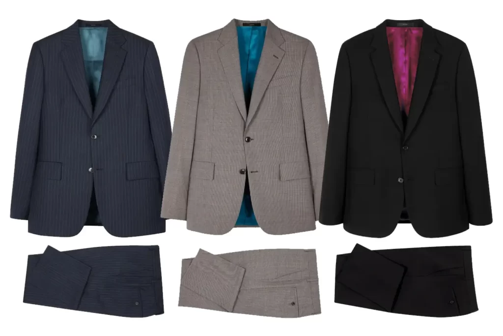
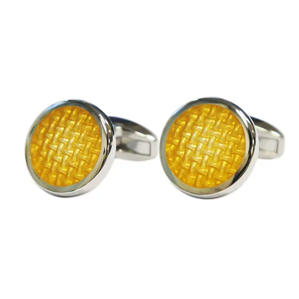
A good starting point to find colours that will harmonise your cuff-links with the suits that they will be worn with is the colour wheel. Invented in 1666 by Isaac Newton, the colour wheel has passed the test of time and become the basis for colour theory because it visually shows the relationship between colours. Colours that are opposite one another on the colour wheel are said to be complementary. This colour combination provides high contrast and bold impact and as a result these colours will appear brighter and more prominent. Using the colour wheel, navy is complemented by gold tones. This explains why gold cufflinks always look good with a navy suit. Conversely grey and black are complemented by silver tones making silver cuff-links look better.
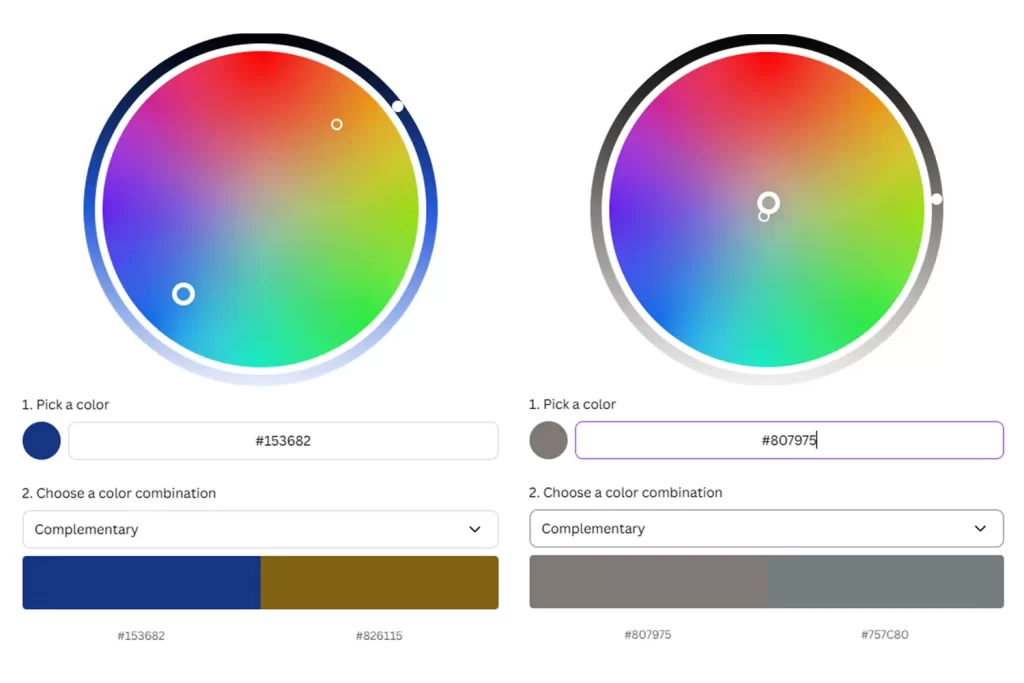
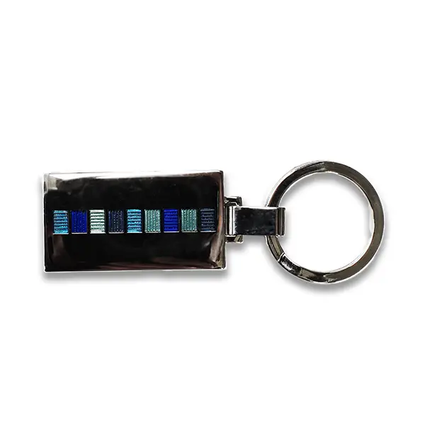
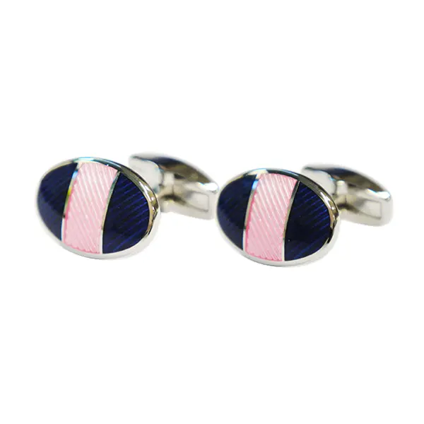
The inner lining of the suit often has a contrasting colour and is an opportunity to introduce more bold and vivid colours into the clothes in a subtle place less likely to catch the eye. This colour can be used as a dominant or accent tone to create a visual link between the cuff-link and suit. Using this colour in your cuff-link design allows the prospect of an analogous colour scheme. In colour wheel terms this means using three colours side by side on the colour wheel. Using the suit lining colour and two colours alongside it on the colour wheel will ensure that the cuff-link design will fit visually with the suit tailoring.
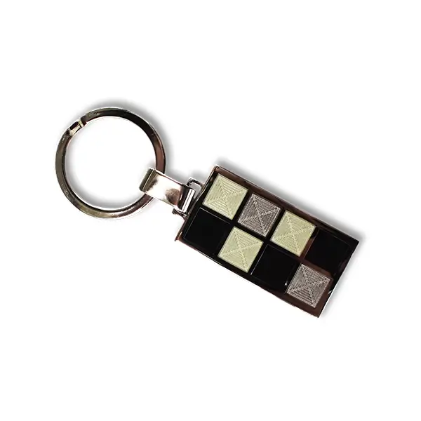
A final colour scheme to consider is monochromatic, whereby you choose a single colour and then embellish it with tones and tints of the same colour. A tint is created by adding white to the base colour, whereas a tone is produced by adding grey. This colouring method is perfect for a more subtle, conservative cufflink.
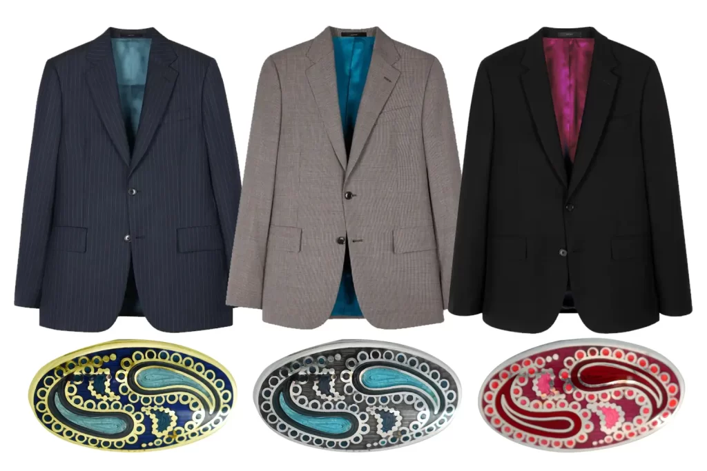
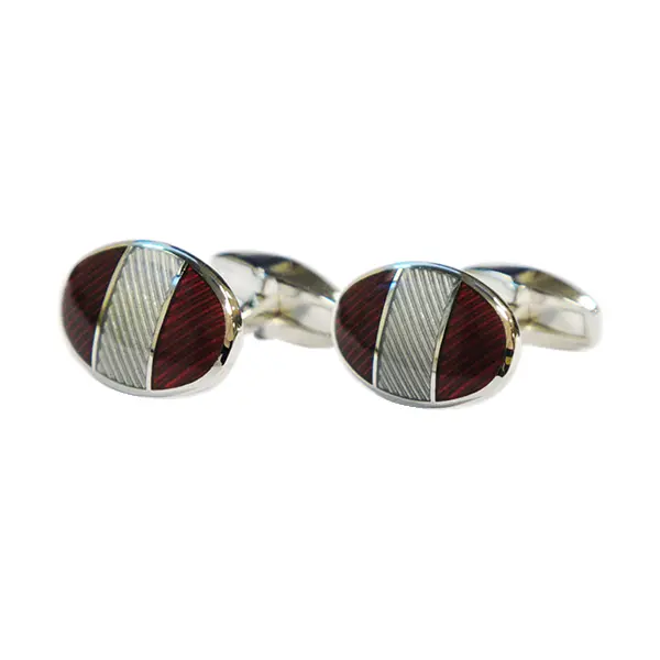
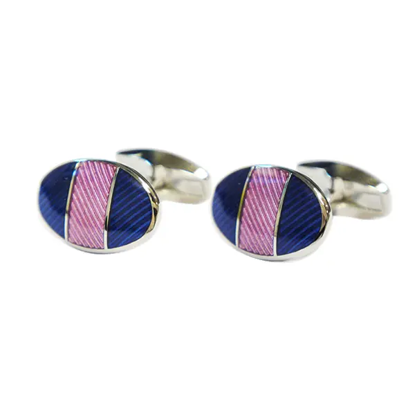
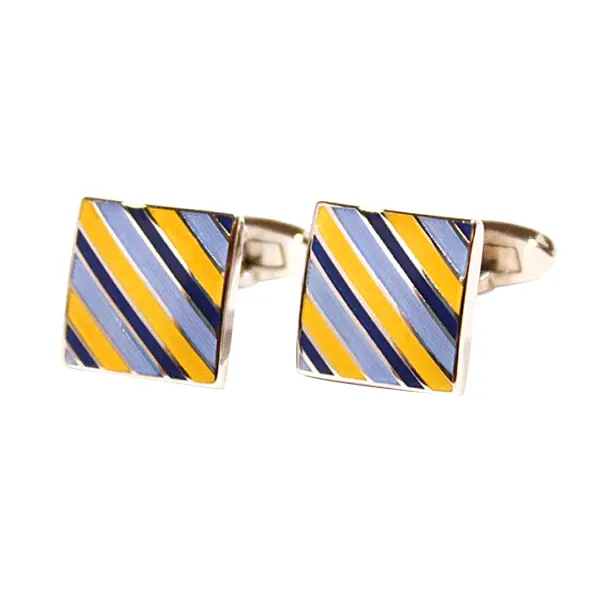
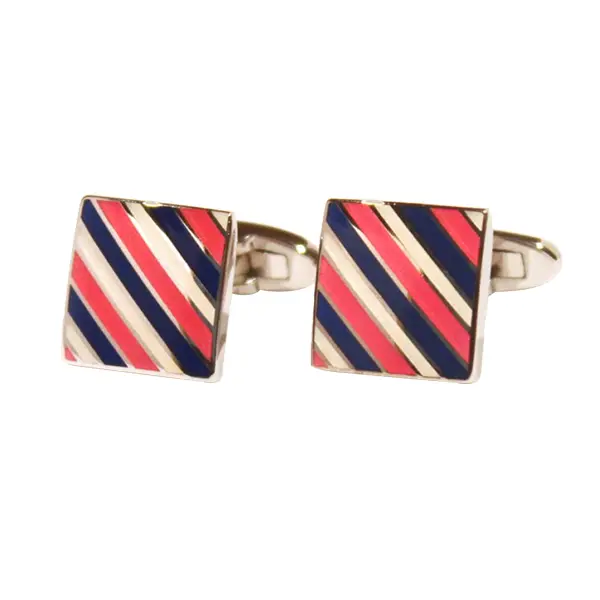
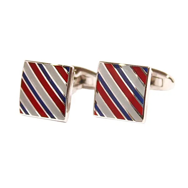
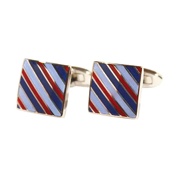
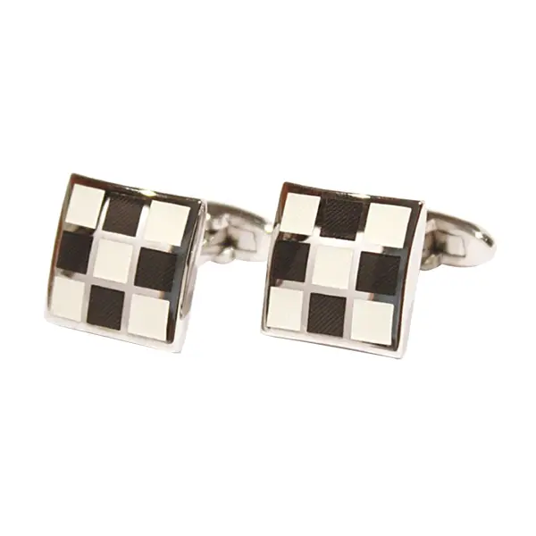
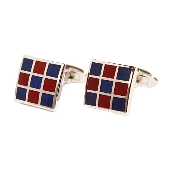
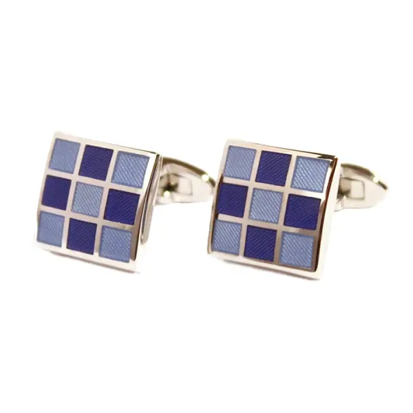
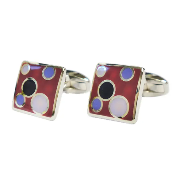
Using the colour theory explained in this case study the pre-designed cuff-link was coloured with enamels to match each suit style. Gold plating was used to add complementary colour to the navy suit and an analogous colour scheme of navy, blue and cyan supplemented the cyan inner suit lining. Silver plating was paired with the grey suit and a monochromatic colour scheme of cyan tones again supported the cyan inner suit lining. Finally, silver plating was paired with the black suit and an analogous colour scheme of red, claret and pink matched the claret suit li
Merit Badge & Regalia Co Ltd, 4 George Baylis Road, Droitwich, WR9 9RB, United Kingdom
+44 (0)1905 791350 | sales@meritbadge.co.uk